Wow, those are certainly some attractive jobless numbers there. In fact, they’re so good I stole the graphic so I could stick it up here.
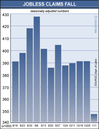
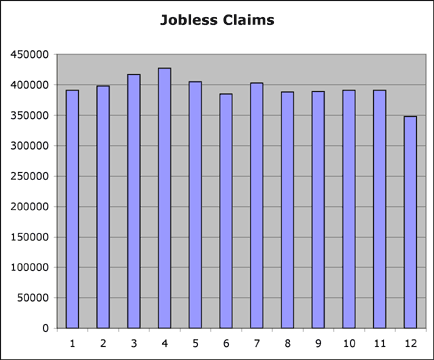
Damn, but that’s good. So good, I decided to reformat it a bit so I could admire it again.
Oh. And I guess employment dropped by 41,000 anyhow. So, uh… what’s unemployment look like, anyhow?
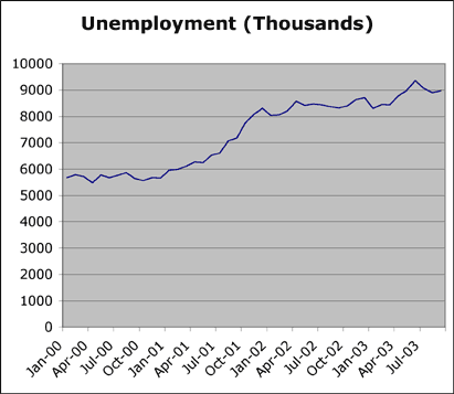
As they say, all this really means is that the rate of increase has decreased.
Edit: on rereading, I’m not sure if I was sufficiently sarcastic in my cries of mock delight, above. Shorter Popone: “The Reuters graphic was manipulated to make the drop in claims look like a big deal, but it wasn’t. Also, unemployment is still rising.”
5 Comments
Wow… someone really learned lesson one of how to lie with graphs here. That first graph is really inexcusable.
You *have* read Tufte, right? I think chopping off the bottom of a graph *is* lesson one. Or maybe two.
“Also, unemployment is still rising.”
Well of course it’s still rising, the population is rising. There can be a decrease in the percentage while still experiencing an increase in the total.
Using raw totals is yet another way to be deceptive. That third graph is every bit as deceptive as the original, IMO.
And while we’re on the subject of deceptive graphs, here’s a good one.
Daschle Graph
I’m convinced that I’m the only person in America that noticed it. This one’s so bad, they didn’t even have the decency to chop the bottom off of it. 1.4 rounds to 1.0, doesn’t it? But 2.2? We’ll leave that one alone.
Heh, yeah, that’s a great one.
Good point on the third graph, btw. It’s a fair cop, although I wasn’t intentionally deceptive.